Friday 30 September 2011

Final Script

1. Int. Victoria Coach Station. Day

A coach comes into the station and as people start getting out we cut to a shot of 'The Immigrant' with a big backpack, looking around slightly bewildered. In his hand he holds a plastic bag full of apples

The Immigrant

(Voiceover)

Yes, Yes, Yes. I finally reached my destination. After everything I've gone through, this is it, my utopia. It does seem strange, however, this country. Oh well I will yet learn to love it.

2. Ext. Central London. Day

Immigrant' now leaves station and goes outside (with the backpack) walks around London, there is no voiceover but some light hearted, positive music plays while there are a couple of shots of him walking past some famous landmarks. The bag of apples stays with him.

3. Ext. At Trafalgar Square. Day

'Immigrant' now goes to see famous landmarks; Trafalgar square, London eye. At Trafalgar square he has his head constantly tilted up and he never takes his eyes of the column. He bites an apple while his eyes stay fixated on the column.

The Immigrant

(Voiceover)

Wow. Wow. Wow. Just Wow. This is amazing; I have never seen anything so big and amazing with such strength pulsating off it.

4. Ext. Outside London Eye. Day

At the London Eye his head keeps turning in a circular motion.

The Immigrant

(Voiceover)

Singing - You spin me right round, baby right round like a record, baby Right round round round You spin me right round, baby Finishes singing. I need to eat an apple.

5. Ext. Central London. Day

A long shot of the immigrant in a crowd smiling and as the camera zooms in as he raise an apple to his mouth and the camera finishes zooming in when the whole screen is filled with just the apple. (Positive really happy music plays until zooming finishes when the music suddenly ends.)

The Immigrant

(Voiceover)

I love this place, I could have never expected to be so lucky and to get to live in such an amazing city.

6. Ext. Bad part of London. Night or Dark

(A darker more sinister music starts playing) Slowly the camera zooms out from the apple and the character's face has changed - not quite sad but neither is it happy. The surroundings are dark, maybe industrial.

The Immigrant

(Voiceover)

Well this feels more like home. I guess I should be grateful it's not any worse.

7. Ext. Council Flats etc. Day

Walks out of some flat that's in a very mediocre area and as he goes to a bus stop he has a shoulder bag. Somebody stumbles into him without even acknowledging that it takes place and the bag falls off with apples spilling out while the 'somebody' doesn't stop to help.

The Immigrant

(Voiceover)

My precious. My precious, I will save you!!!!!!!

8. Ext. Park. day

The immigrant goes to a park on his lunch break and goes to seat on park bench. There is a girl sitting on the bench reading a book. Immigrant looks shifty. Eats apples from lunch box.

The Immigrant

(Voiceover)

Hmmm I wonder if she wants an apple. If fate is on my side I will meet her again and talk to her then.

9. Ext. park. day

Same situation as the day before but this time he looks at her but then hangs his head down, she looks at him but he cannot see her look at him. Eats apples from lunch box.

The Immigrant

(Voiceover)

He sighs - maybe next time

10. Ext. Park. Day

Sits down next to her and as he takes out an apple it slips out of his hand and she picks it up and as she gives it back to him, their eyes meet and as their hands touch there is a spark between them.

The Immigrant

(Voiceover)

I gotta love my apples.

Screen cuts to black.

Credits roll with apples in the background.


Comments on the redraft.

We decided to get rid of the scenes in school as they seemed to be adding too much length to our movie and we also noticed that it didn't flow quite as well as the rest of the story. The part of the story which takes place in the park allows the movie to have a happy ending as well as adding a romantic element to the story which in turn expands our potential audience. The decision to have no dialgoue and just voiceover is a good choice as due to our technical limitations this will make it much more practical when filming our film.

Thursday 29 September 2011

1st Draft of script

Int. Victoria Coach Station. Day

A coach comes into the station and as people start getting out we cut to a shot of 'The Immigrant' with a big backpack, looking around slightly bewildered. In his hand he holds a plastic bag full of apples

The Immigrant
(Voiceover)
Yes, Yes, Yes. I finally reached my destination. After everything I've gone through, this is it, my utopia. It does seem strange, however, this country. Oh well I will yet learn to love it.


Ext. Central London. Day

Immigrant' now leaves station and goes outside (with the backpack) walks around London, there is no voiceover but some lighthearted, positive music plays while there are a couple of shots of him walking past some famous landmarks. The bag of apples stays with him.


Ext. At Trafalgar Square. Day

'Immigrant' now goes to see famous landmarks; Trafalgar square, London eye. At Trafalgar square he has his head constantly tilted up and he never takes his eyes of the column. He bites an apple while his eyes stay fixated on the column.

The Immigrant
(Voiceover)
Wow. Wow. Wow. Just Wow. This is amazing, I have never seen anything so big and amazing with such strength pulsating off it.


Ext. Outside London Eye. Day

At the London Eye his head keeps turning in a circular motion.

The Immigrant
(Voiceover)
Singing - You spin me right round, baby right round like a record, baby Right round round round You spin me right round, baby Finishes singing. I need to eat an apple.


Ext. Central London. Day

A long shot of the immigrant in a crowd smiling and as the camera zooms in as he raise an apple to his mouth and the camera finishes zooming in when the whole screen is filled with just the apple. (Positive really happy music plays until zooming finishes when the music suddenly ends.)

The Immigrant
(Voiceover)
I love this place, I could have never expected to be so lucky and to get to live in such an amazing city.

Ext. Bad part of London. NIght or Dark

(A darker more sinister music starts playing) Slowly the camera zooms out from the apple and the character's face has changed - not quite sad but neither is it happy. The surroundings are dark, maybe industrial.

The Immigrant
(Voiceover)
Well this feels more like home. I guess I should be grateful it's not any worse.


Ext. Council Flats etc. Day

Walks out of some flat that's in a very mediocre area and as he goes to a bus stop he has a shoulder bag. Somebody stumbles into him without even acknowledging that it takes place and the bag falls off with apples spilling out while the 'somebody' doesn't stop to help.

The Immigrant
(Voiceover)
My precious. My precious, I will save you!!!!!!!


Ext. Outside school. Day

The immigrant is in a suit and proceeds to go into an office. Camera looks at the door, people go past and time is sped up until he exits the room. 

The Immigrant
(Voiceover)
As he's going in - Let's see what job I am able to get with my qualifications.
As he's coming out - Well it's not exactly what I hoped for but the prospects for a promotion are high. Never know when it may happen so just in case i wIll stay in my suit.


Int. In school. Day

Initially only a limited view of the immigrant in a suit is visible but then as camera zooms out you see that he's either sweeping or mopping the floor.

The Immigrant
(Voiceover)
[Whistles some positive tune]


Int. In school. Day

Goes on mopping the floor and puts his hand in his pocket and as he fumbles around his face becomes scared, checks other pockets but as he cannot find what he's looking for, he drops the mop and runs around school until he finally goes into a small room and there sitting on a table he sees an apple and a close up of his face shows a smile.

The Immigrant
(Voiceover)
When Starts running - Benny Hill tune

Screen cuts to black.
Credits roll with apples in the background.

Comment:
We decided to have no dialogue as it allows us to keep in line with the common short film conventions but it additionally borrows from classic silent films where the story was told through expressions and cinematography, not just words.

Wednesday 28 September 2011

Brain Storm Idea 3 (Synopsis of our Actual Film)

The Polish immigrant arrives at Victoria coach station, he goes on to go around central London and see the main tourist attractions, maybe Trafalgar square, London Eye... something else in central London.


He goes to a worst part of London and it is made clear that's where he is going to live. He might make some funny remark about how its better than his country's presidential palace. He looks for a job, goes through interviews and in a voiceover in a serious voice says funny things, finally gets a job as a cleaner in school. Some funny encounters in school. Finally he finds love in school and tries unsuccessfully to get a date, but movie finishes with an apple themed encounter.

Throughout the movie some funny scenes will have an apple incorporated as a motiff to put across some comedic scenes to the viewer. The apples will also signify the pride and happiness of the immigrant which either rises or falls as the movie develops.

After analysing our 3 ideas we decided that this idea was most suitable to our current means and abilities as it was practical to film it and we would not be overflowed with work. Additionally the themes that are present in this film idea are relevant to British society and our target audience would be able to relate to this idea more readily.

Brain storm idea 2

The second idea that we had was to do a short film in the action thriller genre. The film would have involved a character having to complete an objective, like getting something back that is very important. We would have followed 2 characters and show how their story lines cross, one of the characters would have needed to get something from the other and this would have been the dilemma. The audience would not have know what he was trying to get till the end, creating suspense and this would have allowed for a twist or red herring. The film would have been like ‘Double take’ by Toa Stappard, where very little was revealed, creating allot of suspense.


We decided not to this story as it would have been quite difficult to do as a short film, as there would have been allot work on trying to make things clear to the audience but not telling them too much, it would have been like trying to make a feature length film as a short film, which won’t work. We also wanted to make more of a light hearted, less intense film, instead of a hardcore thriller as our younger audience will be able to relate to it more.  

Brain Storm idea 1


The first concept for a short film we had was to do a short film parody of a feature length film. Our first idea was to do a parody of James Bond movie as it is classic and has very obvious themes and conventions so the audience will understand what we are attempting to do. We then thought of a Harry Potter movie this is also a familiar movie to people, it is also targeted at an audience of our age, which will also make it easier as that is the main audience we will be able to distribute to. We knew that these parodies would be too difficult to do as lots of extras will be needed, which will be almost impossible to get or organised. Sets would have to be made and we will be trying to squeeze a feature length film into a short film, which will be almost impossible especially with the budget that we have, we also don’t have the recourse required to this and it would take too long. We then thought we could do a short film parody of a more simple film "8 mile" it might have also dealt with social issues as well, such as people in the lower class struggling to reach their dreams, but faced the problem of people actually understanding the concept because not everyone has seen this movie. So we decided not to use the idea of a parody, instead we said we will keep the idea simple.

Magazine Reviews 4

Analysis of Magazines in terms of written codes among different publications and Analysis of magazines film reviews in terms of Visual Codes
 
Written codes in magazines are communicated through the language used. Mode of address is important in the way that it uses language (vocabulary) and style to 'speak' to its audience. In its most basic form it could address the audience in either a formal or a casual manner. It could also be; humorous, serious, chatty or maybe even professional. The mode of address is identified is identified through the selection of words and the style as well as the complexity of the sentences.


The Semiotics of the reviews are also sometimes referred to as symbolic codes and they are based around the choice of images, fonts and colours. When a reader sees a magazine review, the connotations that he gets from it is very important. So for example the use of an Arial font or the colour green or even 'hue saturation.' When a images are selected for use in magazine reviews several important choices have to be taken by the photographer; selection, cropping, framing and Point of View (PoV). In terms of selection when there are many shots of the same subject a photographer has to choose the image that most suits the article, cropping serves a similar purpose with making sure that the audience concentrates on that particular area of the image. Framing is  key when taking the image and the photographers has to choose whether the subject is close or far and whether some things are included and left out. The way that an image is perceived is influenced by the point of view from which the image is taken.


The layout, font and typography of newspapers depend on its readership and the audience that it tries to target as well as the type of content that it usually presents. It enhances the character and identity that I am able to percieve in a magazine. Font is especially effective at doing that and it can suggest whether a publication is serious or fun. If a 'House Style' is followed than a newspaper will have a look that makes it stand out from other newspapers. The use of graphics will reflect the readership of a magazine and it will also suit the audience that the newspaper is targeting. The placing of photographs affects how an article is read and because of the way we're used to reading text in the west our eyes is more readily drawn to an image that would appear on the right-hand page which is the reason why adverts on that side cost more.


The images that are used in film reviews are really useful and effective at breaking up an article. The amount, type and layout is what usually differs between different magazines meaning that each has an instantly recognisable style. For example a magazine could organise its reviews so that its built around a main image. Another layout could be a page in an article with smaller images spread around it. 


Tuesday 27 September 2011

Magazine Reviews 3

Conventions of a magazine page layout in terms of technical codes


1. Section Title
2. Headline
3. Strap lines
4. Introduction
5. Subheadings/breakout paragraphs
6. Columns
7. Pictures
8. Graphics and Logos
9. Font and Typography
10. Breakout boxes
11. Call to action
12. Byline
13. Issue info
14. Captions

Variations in layout are largely due to the differing readership and content of newspapers. Some variations can occur between diferent newspapers as certain layouts are modifiable.

The arrangment of columns is one of those things as text on a page is broken up into columns. Different magazines have varying numbers of columns on a page. Breakout boxes and the introduction can be either presented in different way or they may be positioned around different places on a page.The Fonts and Typography vary greatly depending on the newspaper and each paper chooses its own style of font to give itself an original character and identity. Typography is the way in which a text is laid out on a page; size, spacing, line length etc. Articles in a newspaper will always follow a certain 'House style' E.g. same size and font for all headlines.Headline style even though it is technically part of typography is quite important in terms of variations as it can produce in the reader different emotions which will affect how an article is read. Additionally strap lines are also used around a title so that certain specific details are what the reader would notice first. Subheadings are used to break up longer articles so that it's easier for the reader to read the story without getting bored or muddled up. Graphics are one of the differences in layout where variation amongst newspapers occurs most often. They can be use to signal regualr section within a paper and can also be sued to break up a page and make it easier to read. Photographs and the way that they are used varies hugely among newspapers. Their positioning and the amount of them used can have a large effect on how the reader would react to an article. This is shown by the fact that our eyes are most often drawn to the right-hand page of a newspaper, which is a reason why adverts on the right-hand page of cost more.

Monday 26 September 2011

Magazine Reviews 2

The main film magazines in the UK

There is a large number of magazines in the UK magazine market as it has proved quite a lucrative one. I will analyse 3 magazines that I believe best reflect the market as a whole. Out of the three magazines I will analyse the most popular is Empire closely followed by Total Film, which is a 'lads' magazine, and finally there is Sight & Sound which is a specialist film review magazine that aims at the share of the market which is constituted by the more sophisticated and cultured reader.

Empire

This magazines holds the largest share of readers in the whole market and as such it does tend to lean to a populist form of presenting their content. The magazine analyses both mainstream and art films but it naturally puts much more emphasis on the former which is in line with its profile. It contains a lot features aimed at consumers and even produces an additional complementary magazine titled 'At Home' which analyses DVD releases.

Total Film


Total film is a magazine aimed at the so called 'lad' culture and it is intended to be a magazine for 'blokes' meaning that the magazine often has a funny approach to the way in which they review movies. There is a certain degree of similarity of format between Total Film and Empire and in the way that they present their content.

Sight & Sound


Sight & Sound is a magazine that has been present on the British market for quite a long time as its first publication was in 1932. It is quite different to its, above mentioned, mainstream competitors as it does reviews of numerous art house movies with this being their main focus and mainstream movies being of lesser importance to the magazine. The magazine has however been criticised for producing content that could be considered snobbish. Roger Ebert described it as "by far the most respected of the countless polls of great movies--the only one most serious movie people take seriously."

Saturday 24 September 2011

Magazine Reviews 1

The purpose of magazine film review

Film reviews serve a different purpose to film posters as film posters are meant to give the audience a taster as well as a short idea about what they can expect in a movie. Film reviews on the other hand are directed at people who want a coherent and developed opinion on a movie, in order to decide whether they want to see it or to get a better understanding of a movie that they have just watched and find out its context. The interaction that the audiences have with those two mediums is quite different, this is important as the general public rarely spend more than several seconds analysing a poster meaning that the message that it sends has to be compact and to the point. A film review is expected to take up more of a person's time and as such a completely different approach is taken when producing the posters as it's aimed at a different sort of audience.


Film reviews are an important part of film's marketing campaign as a review can make or unmake a movie which does give a film review a certain element of risk. However most movies decide to go through with giving a film magazine a chance to preview the movie and to write a review about it as it is a form of free marketing that especially if present in a magazine with some renown can promote a movie which leads numerous film companies to just ignore the risk and go through with it.

Friday 23 September 2011

Development of film posters

Rebecca (1940)


 Bonnie and Clyde (1960's)


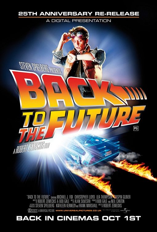
 Back to the Future (1985)


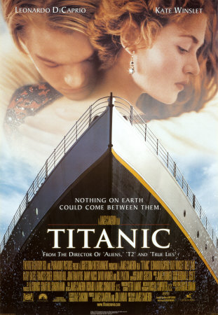
The Titanic (1997)


Inception (2011)

Posters over time have definitely moved forward and changed drastically in the style used and the purpose it was meant for. In the 1940's posters were drawn out and they were pieces of art but nowadays they are computer generated (Inception) and it is 100% a promotion tool to get as many people to see the film as possible. We now also have production software like photoshop which can do various effects very easily, this will reduce the time needed to make the poster, making it a cheaper process. This type of software also makes it easier to make a series of posters. It can clearly be seen that the colours on each poster becomes much sharper and better quality as they progress. "Rebbeca" has a low quality image, however this is not always a bad thing as it gives the audience an intimate feel with the movie, as the poster was drawn by hand.  In the 1940's posters were a promotional tool; it was not so commercialised like posters are today. The posters all share similar conventions, all of them have a picture of the main characters with the name of the actors that play them, this convention is so important that it is still being used after 70 years. 

Thursday 22 September 2011

Purpose of film posters

The purpose of a film poster is to advertise the upcoming film, letting audiences know that a new film is due for release, which raises awareness so that the movie can get maximum views. Film posters always show a positive representation of the movie and provide a range of information such as: the name of the film, the release date, the star actors and actresses who are in the film and the BBFC certification. This information attracts a viewer. Through naming the stars that are popular and well known, people will think the movie is worth seeing because of the reputation they have, also as a catchy film title will be very memorable and at the same time informs them of vital information. Other important information they may want to know about is the certification, to make sure it is appropriate for the people that want to see it, especially if children are going to watch it.


US Version


UK Version


Film posters target specific audiences; sometimes films have a range of posters, which all vary in terms of images and colour to aim for many audiences. The same thing is done when promoting movies in different countries as different countries have different expectations and preferences of films. The American version of the Elizabeth movie poster has red colour scheme which shows the theme of passion which is present in the film, the American audience are known for their interest in the British monarchy and they will be interested in this angle of the story. However the British versions are character posters which present the movie as more of a thriller, they look like wanted posters, which gives it mare edge. 


Where do film posters appear?

One place which often has film posters is Buses & Bus stops. Buses allow for a large space and it mobile, so it travels to many places allowing huge numbers of people to see it, buses also stop giving people a chance to see it even better. The bus stops also have posters, this will give allot of exposure to the film, as there is very little to do at the bus stop so people will almost definitely notice it, this will allow the poster to be more detailed too as people have more time to look at it, unlike billboards.


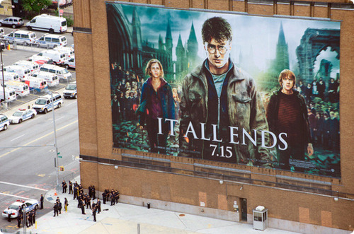
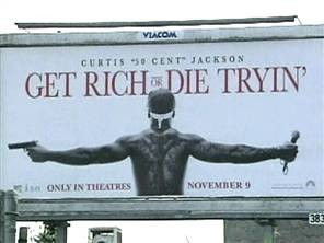
Film Posters are also displayed on large billboards, which will be on motorways so passengers can see at them as they drive past. Billboard posters will have less information because there isn’t enough time to read it, so it will only have the title of the movie and maybe a date just to make people aware of the movie.  

In the modern era of promotion and marketing the internet is a very influential media as it reaches everyone and it is easy to access, and therefore easy to reach the market that is being targeted. The internet can also be very cheap when advertising compared to other forms such as newspapers, Billboards and television. YouTube is a great example of advertising because before you watch a video you have to watch the adverts and there are also adverts on the side of the pages and on the banner of the home page, which millions of people visit. 


Wednesday 21 September 2011

Poster Comparison


Above are example of film posters from the sub genre of romantic comedy, they follow the same conventions used to create film posters for this genre. Both of the posters have huge pictures of the main star actors of the movie, as this is the main part of the movie, we usually can predict what is going to happen in a romantic comedy but the famous actors are the ones who draw the viewer to a certain movie. The images if the main actors are also light hearted, in the "Hitch" poster Will Smith has a big smile on his face, and in the "Just go with it" poster Jenifer Aniston is not looking happy as she gives a happy Adam Sandler her ice cream, this light heartedness sets the tone for the film. Another similarity between these two posters is that they use bright colours, red, white, blue, this gives the poster a much softer feel.

Romantic comedy film posters are done very differently to other genres like thrillers. Example of thrillers are below, this is less about the star actors and more about the action, as we can see in the "Killer Elite" poster where we see people holding guns. Also the people on "killer Elite" are not immediately recognizable as the pictures of the actor’s aren’t as big as on the romantic comedy poster. Also the expressions on the actor’s faces are much more serious, giving an insight to the potentially tense nature of the film. The
colour schemes on the romantic comedy posters were very soft however on these thriller posters, they use red, black and grey giving it a very intense feel, which is what they are trying to achieve as thriller films are meant to be intense.

The way a film poster looks is heavily based on the genre of the movie; Promoters have to get this right as they need to convey the right message about the movie to the people looking at the poster. If a thriller poster looked like a romantic comedy poster the movie will attract the wrong audience, which will bring its movie ratings down.


Tuesday 20 September 2011

Posters

Film posters are produced to advertise a movie, lots of time and money is spent to get the poster done in the best way to promote the movie and tell the viewers allot about the film via pictures rather than words. There isn't enough space to put too many words on the poster, this would not be effective as people usually see poster as they are walking past or a bus is going past.


This I-Robot poster is a good example of a film poster as it has a lot of the usual conventions of one. It obviously has the movie title in bold very clear for everyone to see, this is especially necessary because people need to easily see it. Under the title there is a tag line "one man saw it coming", this is the catchy phrase that given to the movie, which gives some insight to what the Narrative, toe and plot. I would guess it is about one man going against the world. There is also a big iconic picture of the star, will Smith, which everyone will recognise, allot of people will also only go and watch the movie just because of Will Smith. The picture of will smith shows him with a very serious face, which again shows the tone of the movie, this is useful because Will Smith also does allot of light hearted films, so the promoters don’t want the audience to get the wrong idea. The background of the poster shows many lines of robots, this gives the audience a glimpse of the theme of the film, it also gives a clue to what the genre is, science fiction. 


Below is a picture of the "Romeo and Juliet" film poster.
 This "Romeo and Juliet" film poster is quite unconventional as it has four smaller posters to create one large poster. each poster has its them, "hope", "Vengeance", "Despair" and "Love", these are also the themes of the film this informs the audience about the theme and plot. Using four different posters will also appeal to different audiences as it is portraying different genres, people who enjoy romantic movies will see "love" and think that this is the movie for them, on the other hand people who like action and violence will see "vengeance" and a picture of people holding guns and think it’s a movie they would like to see. The poster does follow allot of the usual conventions too like the names of the stars in the movie which will create allot of attention around the movie especially with an A list actor like Leonardo Dicaprio, there are also pictures of the stars; Leonardo Dicaprio and Claire Danes. The title of the movie is very important, especially with a one as famous as this, "Romeo & Juliet" this is the most clear thing on the poster so it can’t be missed, this is important for every poster. Romeo & Juliet is one of the most famous stories in history and almost everyone knows it, this is reflected in the tag line "The greatest love story the world has ever known", this is an effective tagline because it is probably true, it will also make the people who don’t know about the story go and watch it because they are missing out on something that they are supposed to know.